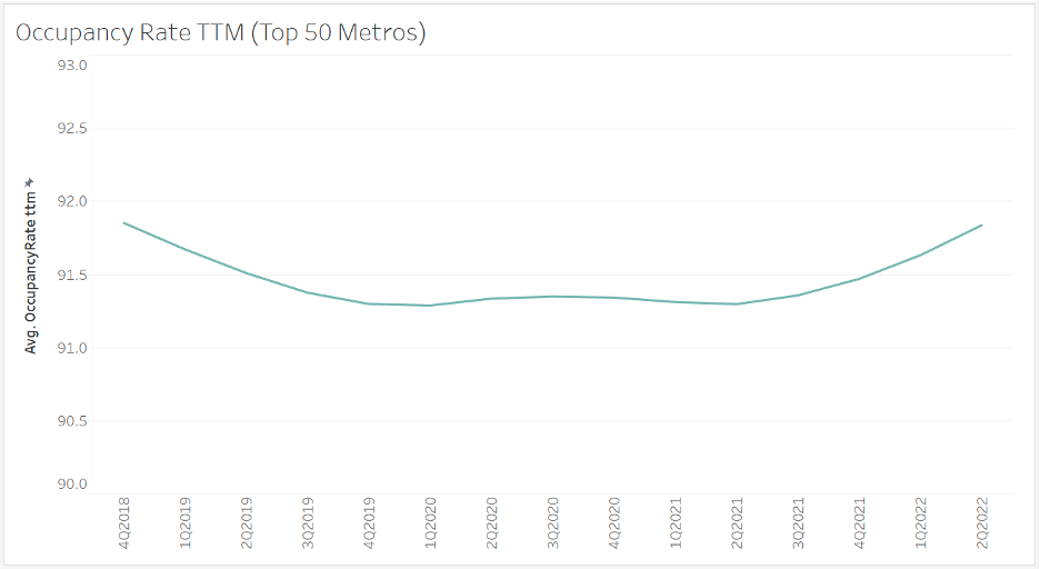
If we take a look at the overall occupancy trends for the top 50 metros, we can see that a shallow U-shape has formed over the past few years. While this pattern shows a modest dip followed by a recovery, this may not be the story for individual metros.

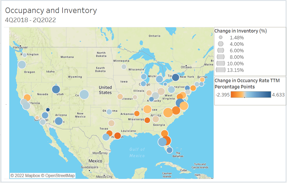
The map below covers the same time gap, going from the end of 2018 to the first half of the current year. It compares the change between the two endpoints from an occupancy and inventory perspective. The map shows that there are diverse changes across the different markets. The large, blue bubbles represent markets that have seen relatively large increases in inventory and occupancy. This is an impressive combination as demand for space must be quite strong for occupancy to increase when a lot of new space is being made available.
We can also see some differences across geographical clusters. For example, apart from Florida, the Southeastern quadrant has a lot of orange, indicating falling occupancy rates. However, there are also a lot of large bubbles in this region, pointing to larger increases in inventory, which could explain some of the decreasing occupancy.

Each market is unique and will react differently to the everchanging economic conditions. This map only provides a snapshot of a complex market, so make sure to stay up to date as we continue to provide comprehensive coverage of the MOB sector.

